
You are using an out of date browser. It may not display this or other websites correctly.
You should upgrade or use an alternative browser.
You should upgrade or use an alternative browser.
Carf MiG-17
- Thread starter dwaynewoodsii
- Start date
dwaynewoodsii
Well-known member
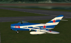
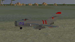
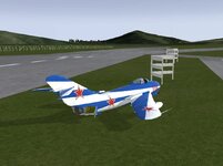
Added some more detail and started working on the scheme I’m going to post it with. The gear is a night mare at the moment while retracting. Added a pilot and cockpit. Last thing to do is the lights and perfect the retraction of the gear.
Attachments
dwaynewoodsii
Well-known member
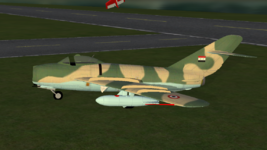
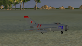
Lights added and scheme complete all that’s left is to work out a few bugs.
Attachments
dwaynewoodsii
Well-known member
dwaynewoodsii
Well-known member
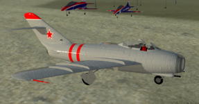
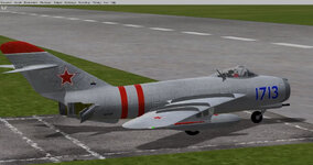
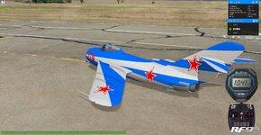
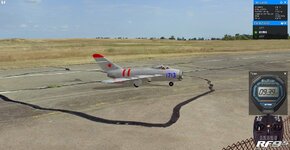
Pretty much done with the airplane and ready to post it most likely later today!
Attachments
-
 1CC5817C-560D-46D0-AFA2-6E961595BB7A.jpeg280.5 KB · Views: 21
 -
 56496B62-CC59-491E-97E6-C2E604283293.jpeg183.2 KB · Views: 18
 -
 84B3C94D-1B09-4545-8102-5ABC675ECFC6.jpeg371.9 KB · Views: 20
 -
 43AEF496-A18C-42D5-B5BB-E77DA708AB21.jpeg368.9 KB · Views: 71
 -
 FF578DEC-711B-418E-9DFC-B3DA4788F912.jpeg316.4 KB · Views: 22
 -
 1015D02C-D635-4AA7-BED4-C65B2A6E91D4.jpeg323.8 KB · Views: 22
Bill Stuntz
Well-known member
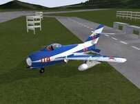
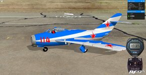
That "114" in red on a blue background with no white outline really messes up my eyes! My eyes like the outlined stars, but hate the number. And the narrow red band outside the white on the stars just kinda disappears. Something about the red/blue interface just doesn't work for me. It's like the red/blue vibrates & I just can't focus on it properly. Is it just MY eyes, or does it happen for other people, too?
legoman
Well-known member
Is this better?That "114" in red on a blue background with no white outline really messes up my eyes! My eyes like the outlined stars, but hate the number. And the narrow red band outside the white on the stars just kinda disappears. Something about the red/blue interface just doesn't work for me. It's like the red/blue vibrates & I just can't focus on it properly. Is it just MY eyes, or does it happen for other people, too?

Bill Stuntz
Well-known member
I was just talking about the blue/white one. As I said, it's the red directly on blue that bothers my eyes. I've also had trouble with posters using red letters on blue posterboard... I have great difficulty reading them. I don't know whether it just me, or if others have the same problem. It's only with bright red on a bright blue background... and I suppose the reverse of that. Trouble is, that bright blue is my favorite color. I'm not colorblind, but I have no artistic color sense. I don't know how many times I've had to change clothes because my wife said something like "You're not REALLY going to wear that shirt with those pants, are you?" - so I don't.  After 30+ years, I no longer own any shirts/pants that don't match... according to her color sense.
After 30+ years, I no longer own any shirts/pants that don't match... according to her color sense.
Last edited:
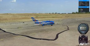
Very cool. The one thing I never understand as a model builder myself is why so many people put external tanks on models and RC planes. The plane only carries them in real life because it has too. Why add them to a plane that has no need for them? I always like the planes to look as they were designed, slick. I can understand some weapons like missiles etc because they are cool, but drop tanks.
Can we download this from somewhere?
Can we download this from somewhere?