Past versions of RealFlight have offered some minimal filtering options in selection dialogs, particularly the Quick Select (vs. the MFC dialog from the main menu). RealFlight Evolution expands this idea with a much more powerful set of filters that you can apply to aircraft, airport, and scenario selection dialogs. I'd like to point these out because I think they're incredibly useful and I think a lot of you will also enjoy having them.
Let's use selecting an aircraft as an example.
First, open the Free Play --> Aircraft menu.
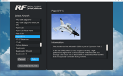
Then, click the "Show Filter" button or press Ctrl-F on your keyboard to open the filters.
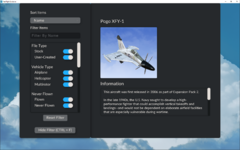
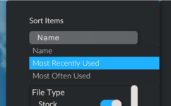
The default sorting is by name, but you can click that to select a different option.
You can also enter text in the "Filter By Name" box which is useful if you only know part of the name of the thing you're looking for and aren't sure what it starts with, or if you want to see all the E-flite models for example.
Scroll down to see more filtering options.
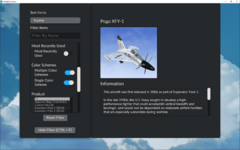
And the rest:
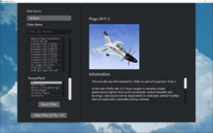
You can combine the above however you see fit. After you've made your selections, simply click the "Hide Filter" button or press Ctrl-F again on your keyboard to go back to the standard selection dialog and see your updated results.
Let's use selecting an aircraft as an example.
First, open the Free Play --> Aircraft menu.

Then, click the "Show Filter" button or press Ctrl-F on your keyboard to open the filters.

The default sorting is by name, but you can click that to select a different option.

You can also enter text in the "Filter By Name" box which is useful if you only know part of the name of the thing you're looking for and aren't sure what it starts with, or if you want to see all the E-flite models for example.
Scroll down to see more filtering options.

And the rest:

You can combine the above however you see fit. After you've made your selections, simply click the "Hide Filter" button or press Ctrl-F again on your keyboard to go back to the standard selection dialog and see your updated results.
