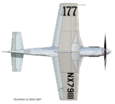
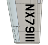
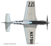
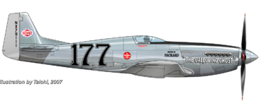
When you say "stroke", (referring to the text), I`m thinking that you`re referencing the black line outlining the the white text, not where the drop shadow part of it is . I meant for you too look at pic. #3, NOT #6 (my bad, sorry)...Lengthwise, yeah, it`s sorta hard to determine what`s right or not, I do agree, in the rendering, the text does look longer on the right side, but one thing is certain, the text is past the leading edge of the wing......I think that once the text is at the right size, THEN, you can size the exhaust accordingly, that`s what I was trying to get across in post #236 by making the text and exhaust longer and taller based on available pics., just imagine what the length of a Merlin V-12 engine block is, and I think you`ll get where I`m coming from.

")